Something that is commonly overlooked by a lot of small businesses and local schools, is that their website also needs to look and perform great on mobile.
The stats
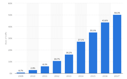
Did you know that over 50% of all website views are from a mobile device and it just keeps on growing.
This has increased massively since only 5 years ago and the trend does not seem to be slowing down. The only sure thing is that in the coming years there will be a huge amount of different screen sizes. To maintain your brand image or, more fundamentally, just for your website not to hurt potential customer’s eyes as they read it.
Okay, it’ll look nice… why bother?
There’s actually quite a few reasons to make your website responsive (mobile friendly), aside from the huge potential market of customers you’re missing out on.
Search Engines
Google and other search engines like mobile friendly websites and rank websites with a responsive design higher on the list.
Social Media
A huge amount of people using Social Media now do it primarily on their, you guessed it, mobile devices. This means that as you post a link to Social Media, the majority of people who will click on the link through to your website will be on a mobile device.
Easy Maintenance
If you have had experience with old-school mobile websites then I can see why the idea of making a website mobile friendly makes you shudder. Fear not though, with a responsive website, it is just one source of information to keep up to date which makes maintaining your website easy and the changes happen for all devices.
Future Proof
Responsive websites adapt to the device screen size. That means that a responsive website will work and look good on any new devices that are released in the future. When there are new devices released every few months, it’s a no-brainer for me that websites should have a responsive design.